Students around the world see the benefits of going unplugged, but their negative reactions are overwhelming: The horizontal bar chart below gives a comparative overview of the emotional responses recorded by the students from all the countries in this Unplugged study. Click on the chart to open up a full-screen version. The chart was derived from both hand and computer coding (using IBM’s ManyEyes software) of a range of keywords identified by the researchers.
The chart below graphs in bars, according to country, the main type of responses from students from that country. So, for example, US-based students mentioned their ‘addiction’ to media only slightly more often than they wrote about the advantages of going unplugged. Seen another way, however, US-based students noted their distress in going without media and their perception of their addiction to media, twice as frequently as they mentioned any upside to the experiment.
One can also read across countries to note that students from Argentina mentioned that going unplugged made them feel isolated and alone twice as often as did students from Hong Kong.

Bar chart (above) of emotions expressed by students attending university in participating countries.
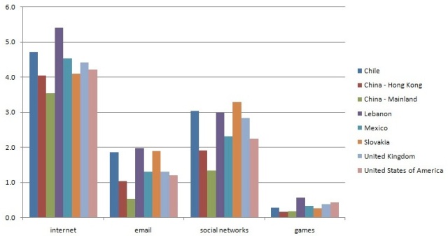
The demographics of the digital natives: The three vertical bar charts below graph responses by students from eight of the ten countries in this Unplugged study to a series of survey questions about their consumption of media. Note that all students reported that they owned a mobile phone (not graphed), and 85 percent or more of all students reported that they owned a laptop.
The final chart below also documents just how digitally “native” this global generation of students is: almost all the students noted that they first used a computer, first surfed online, and first got a cellphone when they were younger than 15, and a majority of students around the world were younger than 10 when they first began to use a computer and the Internet.
(To see more on the demographics of the students who took part in this global study, click here.)

This chart shows the percent of students from each country who reported that they own a smartphone, a laptop and/or an mp3 player (e.g. an iPod). 100 percent of students in all countries reported they owned a mobile phone of some kind.

This chart shows the average number of hours per day that students from each country reported that they spent on the Internet, responding to email, with social networks (e.g. Facebook, Twitter, chat), and playing with online games.

This chart shows how the average age of students from each country when they first received a cell phone or smartphone, and when they first began using a computer and the Internet.
Note that Argentina and Uganda are not graphed in the three charts above; the students from Pontificia Universidad Católica Argentina in Buenos Aires and Makerere University in Kampala did not participate in the SurveyMonkey survey in sufficient numbers to accurately compare their responses.
Note that the same horizontal bar chart (top) as that above can also be seen elsewhere on this site here. Also note that the vertical bar charts (below) can also be seen elsewhere on this site here.


